As front-end developers, we’re often tasked with creating layouts that are visually appealing, flexible, and performant. One popular pattern you might have seen on sites like Pinterest is the masonry grid, a staggered layout where items of varying heights align neatly across columns.
Traditionally, achieving a masonry layout required JavaScript, but with modern CSS, we can accomplish a similar effect without writing a single line of JS. In this post, I’ll show you a simple approach using CSS multi-columns, counters, and SCSS for dynamic styling.
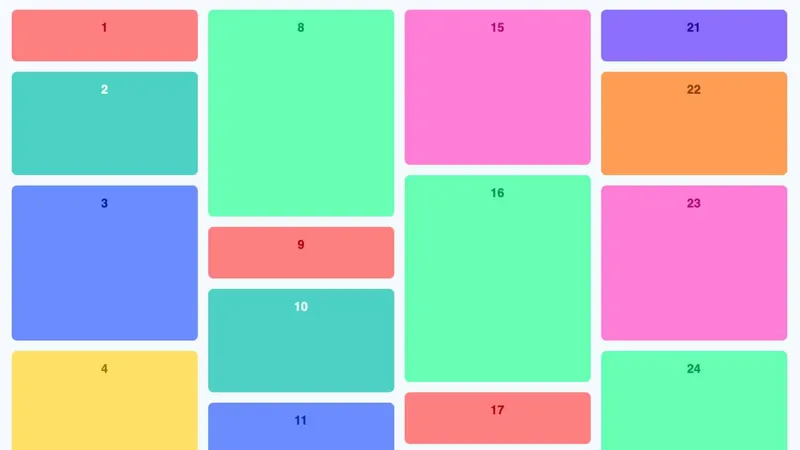
Live Demo Preview
Here’s a live preview of the final result on CodePen:
Why Multi-Column Layouts?
CSS Grid and Flexbox are incredibly powerful, but they align items into rows, which can leave gaps when items have different heights. Multi-column layouts allow content to flow top-to-bottom, then left-to-right, naturally creating a Pinterest-style staggered effect without extra calculations.
.grid {
  column-width: 160px;
  column-count: 4;
  column-gap: 16px;
  max-width: 1200px;
  margin: auto;
}

.grid__item {
  display: inline-block;
  width: 100%;
  margin-bottom: 16px;
  padding: 16px;
  border-radius: 8px;
  box-sizing: border-box;
  break-inside: avoid;
}
Why Not Just Use Grid or Flexbox?
- Avoid row alignment issues → With Grid or Flexbox, all items in a row share the same height, which creates awkward gaps for variable-height content.
- No JavaScript needed → True masonry layouts usually require JS to calculate row placement. Multi-columns handle this naturally.
- Performance-friendly → Pure CSS reduces layout calculations and improves rendering speed.
- Responsive by default → Items flow naturally into columns, adjusting to screen width without extra media queries.
Essentially, this approach is simpler, lightweight, and visually consistent for layouts with lots of uneven content blocks.
Extras added for the demo
Adding Numbering with CSS Counters
Sometimes you want to show an index or label on each card. CSS counters make this incredibly easy:
.grid {
  counter-reset: item-counter;
}

.grid__item {
  counter-increment: item-counter;

  &::before {
    content: counter(item-counter);
    display: block;
    font-weight: bold;
    margin-bottom: 8px;
  }
}
This automatically numbers every item in your grid, no manual updates needed.
Colorful, Accessible Cards with SCSS
To make the grid playful, we can assign each item a different background color while keeping text readable. SCSS allows us to calculate text color relative to background brightness:
@function relative-text-color($bg) {
  @if (lightness($bg) > 60) {
    @return darken($bg, 40%);
  } @else {
    @return lighten($bg, 40%);
  }
}
This ensures your text always has enough contrast, creating a visually appealing and accessible design.
Adding Hover Effects
Small interactions make a big difference. A subtle hover effect can add polish:
.grid__item:hover {
  transform: translateY(-4px);
  filter: brightness(1.1);
  transition: transform 0.2s ease, filter 0.2s ease;
}
This gives items a “lift” and makes the layout feel interactive without JavaScript.
Conclusion
The multi-column layout is a surprisingly effective way to mimic a masonry grid with just CSS. Instead of relying on JavaScript or complex Grid tricks, columns let content flow vertically and naturally avoid gaps.
This approach is simple, lightweight, and responsive, making it a great option when you need a Pinterest-style layout without extra overhead.
Next Steps
- Experiment with responsive column counts using media queries.
- Try combining this with CSS Grid for hybrid layouts.
- Explore the experimental CSS Grid Masonry layout.
- Check out Masonry.js, a popular JavaScript library.
- Learn about a modern take on CSS-only masonry with “Making a Masonry Layout That Works Today” on CSS-Tricks, it covers how Firefox supports masonry-like flow.